
Design Challenge
Submitted by: Christine Tapawan 01/2024
Challenge
User can “Follow Stores” on the PayPay app. Users can select stores from the “Nearby Shops” tab and “Follow” them to receive coupons, stamp cards or notifications directly from them.
Show the current challenges and suggest solutions to getting more users to know & use the “Follow” feature.
Responsibilities
UX/UI Design
Timeline:
6 days (Weeknights + Weekend)
Design Process
Usability Heuristics
Empathize & Goals Alignment
User Flow Chart Mapping
Design Suggestions
User Flow & Wireframes
Visual Design
Success Metrics
Reflections
Usability Heuristics
The first thing I did was perform a Heuristic Evaluation to discover usability problems with individual elements & how they impact the overall user experience. This is focused on the task of “following stores”. I’ve highlighted the main challenges that I found:

Empathize
To help me imagine the users that I’m going to be designing for, I created a persona based on the Japanese market.

Goals Alignment
While specific business goals are unclear, I've aligned potential company goals with user goals. This alignment is based on my personal judgment & insights from PayPay's online articles.

Design Recommendations
Based on the mutual goals & user’s pain points, I’ve narrowed down the user journey into 3 & list down my design recommendations for each of them. My main goal is to build a positive habit of following & checking out stores.
01. Following a store
Provide a space to showcase visually appealing content that makes it easy to discover stores
Show the follow button more often for an opportunity to quickly follow the stores without much thought
02. Searching for a store
Offer a smarter search function w/ recommendations to easily narrow down options
Add better filters and categories w/ engaging interactions
03. Engaging with stores
Have a clutter-free feed that only focuses on stores followed
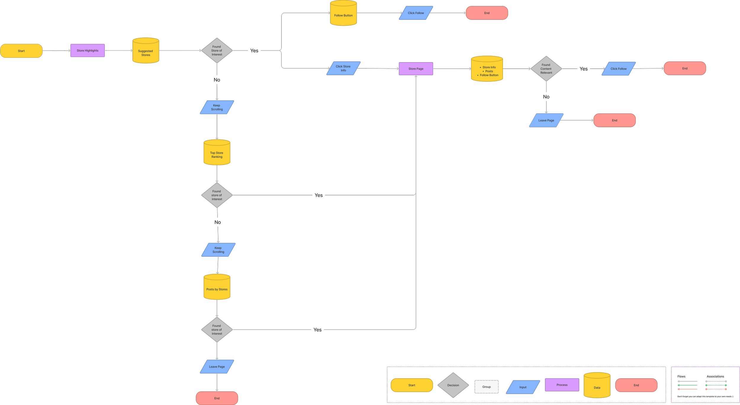
User Flows
I've mapped a new user flow with a specific emphasis on "01 Following a store" and "02 Searching for a store." This decision stems from the project's primary objective of boosting user followers.
Additionally, I aim to base "03 Engaging with followed stores" around the framework of the current "All Stores Information" page within the app.
Note: I’ve added “end” after the users follow a store because it’s what’s required of the task. But I created flows that tries to get them to explore & stay inside the app longer.
Flow 01: Following a store
Flow 02: Searching for a store

Wireframes
I did a few sketches & ended up with these wireframes catered to the 3 user journeys. I then split them into 3 tabs. I felt like this approach is the most seamless, & it enables the users to accomplish tasks more efficiently when focused.
I was cautious about it at first, but I observed similar tab-based experiences in other sections of the PayPay app & among competitors like Line Pay. Personally, I find that Japanese users tend to be more comfortable navigating through tabs than text links.

Visual Design

In terms of visual design, I recommend incorporating bold imagery within cards to entice users to click on them.
For instance, on the highlights page, introducing diverse design layouts as users scroll can maintain their interest throughout the exploration. It also gives us an opportunity to measure how the different layouts are performing.
For the search page, we can consider integrating simple illustrations into the search filter. I’ve drawn this inspiration from Uber Eats app. I believe these enhancements will contribute to a delightful experience during the search process.
Success Metrics
Of course there are numerous avenues for enhancing and iterating on this feature. To measure the success of my proposed solution, I've established these specific criteria:
An increase in the average time users spend on the app per session
A boost in "Follow" click-through rate after engaging with highlighted or recommended content
The growth in the number of likes within posts
Reflections
Reflecting on this project, I recognize that my proposed changes are a lot and might initially surprise users. Despite this, I am optimistic that the cleaner, more focused experience will enhance their efficiency in accomplishing tasks.
If presented with limitations for improvements, I would have initiated the process with the use of an affinity map. I will brainstorm high-impact, low-cost solutions to understand user needs and potentially reveal other efficient ways of improving the experience.
I am sincerely grateful for the opportunity to tackle this design challenge and I’m eager to refine my skills to make positive contributions to the team.